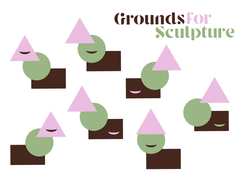
For my Introduction to Graphic Design class, we did a project where we picked a place that was special to us, and based on the feelings/ideas we associate with it, designed a new visual identity/logo for them (Slide 2, Moodboard).
I picked an interactive sculpture garden called Grounds for Sculpture that I went to growing up. I was always a big fan of how you could come up to, touch, and pose with the sculptures rather than just looking like you would in most art spaces. I also loved how all of the art was surrounded by nature.
Based on this, I designed a new logo/visual identity for the park that involved a flexible identity (a logo that allows different iterations to be used) to mirror the interactive nature of the park (Slide 1). We also had to design a brochure and I made mine from pieces of the logo that allowed the reader to pull them apart and assemble their own creations (Slides 3-5).